Modernizing Porter’s Site Navigation
Role
Principal UX Designer
Team
1 other- Design Lead
Timeline
4 months
Tools
Figma, Userlytics

Key Outcomes
Created an intuitive navigation experience for users, validated through testing
Laid the groundwork for a more visually modern design
Established scalable patterns for future site architecture growth
The Task
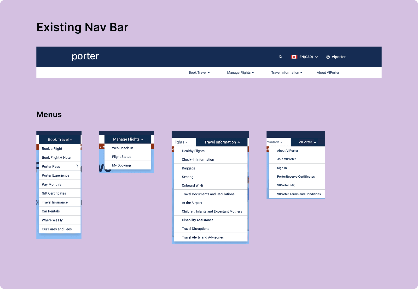
Redesign Porter’s dated header navigation and notifications banner.
prepare well-researched and tested wireframes for handoff to the UI designer.
Known issues:
Lack of IA in the dropdown menus -> Unintuitive, confusing UX
Dated UI
Research & Discovery
Initial User Testing
I performed some user testing to verify the known issues and expose new ones:
Unintuitive organization of information across menus
Users didn’t know which headers to look under for certain information
Unintuitive IA within menus
Users had to read through all list items to find what they were looking for
Information Architecture
I looked at other airlines to see how they were handling IA. The only commonality was the organization of the top level navigation by stage of customer journey. Otherwise, there was no consistent pattern between placement of pages under the headers; it seems that everyone does it differently.
Visual Design
For visual design inspiration, I sought examples of clean and organized navigation in competitors and also across the web in non-related industries.
Strategy
Breaking down the IA
I started by asking the question:
How does the user approach searching for something on our site?
I realized that users have different needs depending on what stage they are at in their journey:
Using the customer journey seemed like a logical way to approach organizing the navigation, but it wasn’t actually that straightforward. Some pages are accessed at multiple points in the user’s journey
Ex. someone might purchase a bag when they book their flight, while someone might add a bag after booking. Thus, the baggage pricing page is relevant at multiple stages.
Limitations
Due to time and resource constraints, I learned that I would not be able to move pages to different menus. It would have been ideal to overhaul the IA, but I had to work within these new limitations.
If I couldn't reorganize the menu items, I could at least focus on the elements that contribute to a good navigation experience: legibility, scanning, grouping, etc.
Wireframing
I began by laying out the dropdown menus by grouping pages according to similar themes and ordering them based on hierarchy of importance. Once the page links were laid out, I was able to make adjustments to further improve the organization and readability:
User Testing
I performed some user testing of these early wireframes, which produced useful feedback that told me I was on the right track.
Use of icons
Testers liked the icons and illustrations. They helped with understanding the meaning of headers/titles, and helped draw attention to important items.
Headers
Grouping of pages via headers helped testers scan to find what they were looking for.
Clickable vs. not clickable: most people could tell what was clickable or not, especially when using the hover state.
Arrangement of links
Testers liked how the page links were separated into separate panels within the drop-down.
Testers found the Help & Contact and FAQ links convenient
Search icon
Some testers missed the search icon entirely. It could be either more visually distinct or a text label could help.
Final Wireframes
I handed off my wireframes to the UI Designer, providing guidelines based on the work and research I had done, as well as the main findings from user testing.
Reflection
Working within constraints
This project taught me about creating a good solution within constraints. I really wanted to redo the IA entirely, starting from scratch, but that was descoped. Thus, I focused on improving the other main issues. The final product significantly improved the user experience, which I would consider a huge success.
Working with the UI Designer
When handing off to the UI Designer, I made sure that the guidelines I created explained the research and testing behind the design. The header is such a prominent component on the website, so it was important that the UI Designer truly understand the implications of the design choices on the user experience.
Next Case Study


