
Jump to a section
Travel Alerts & Advisories Redesign
Improving the Day-of Travel Experience
Role
Principal UX Designer
Team
3 others- UI Designer, Design Lead, Copywriter
Timeline
4 months
Tools
Figma, Userlytics

Key Outcomes
Improved clarity in a key stage of the customer journey
Streamlined processes for internal stakeholders
Created a modern and visually appealing experience
Project Background
At Porter we were engaged in a large, multi-year project to improve communication touch points in the customer’s pre-flight journey. The Travel Alerts and Advisories page was identified as one of the key communication touch points to improve.
As lead designer on the project, I was tasked with:
Modernizing the visuals, aligning with other recently redesigned pages
Analyzing the user experience and make any necessary improvements
This project also gave me the opportunity to improve my leadership skills through mentoring of a Junior UI Designer who was new to the company.
Understanding the Problem
Internal interviews
To get more insight into the usability issues on the page, I ran discussions and workshops with the teams that post communications to the page.
I uncovered the following issues:
Even the teams that post communications to the page could not tell us definitively what type of alert would be housed under each category.
Unclear/illogical categorization of alerts/advisories
The inability to identify when a new alert has been posted
Important information hidden in collapsed accordions
Existing page (alert accordion collapsed):

Existing page (alert accordion expanded):

Usability Testing
I performed unmoderated usability testing of the existing page to validate the concerns uncovered. I also wanted to find out if there were any other issues not yet identified.
The testing validated the initial concerns, showing that:
Users did not understand the differences between the categories
Users felt the information shown in the collapsed accordion was not sufficient
The testing uncovered further insights:
A lack of information hierarchy in the expanded accordions
A lack of guidance/information on next steps to take
The other information on the page was vague
Defining a UX and Content Strategy
In order to figure out a design solution for the page, it would be important to define a UX and content strategy, which were currently missing from the page. Taking into account the issues we discovered, I took a deeper dive into the use of the page:
When do people use this page?
What do they need to know?
Considering when and why people use this page, I made the assumption that:
A user comes to this page with a specific airport / location and date in mind
Recategorization of Alerts and Advisories
Now that I defined the specific use cases, it was time to tackle the reorganization of the different alert types. This was an important first step, as this would determine the structure of the page.
Using examples of past alerts, I identified a clear distinction between types. I used that to create 2 groups to organize the alerts more intuitively:
Those that impact flights
"Day of Travel Alerts"
Ex. traffic around the airport, weather-related events, airport-related updates, and company-wide service issues
Those that are nice to know
but don’t necessarily affect the day-of travel.
"Other Alerts"
includes government or policy- related events, not necessarily specific to a location
Copy Improvement
We recognized that in order to facilitate this new organization, the alerts must be written in a standardized way. This would allow us to organize them in a consistent way on the page.
In addition, there were opportunities to improve the UX from a copy standpoint. We worked with our team’s copywriter to rewrite the templates:
Focusing on the effect to the customer's travel, as opposed to simply stating events
Action-oriented as opposed to informational
Simpler, clearer and more concise
Testing to Validate and Prioritize
A big focus of our solution was ensuring easy readability
Given the complexity of information types shown on the page, a big focus of ours was to ensure that our solution would be easy to read and that users would understand what steps to take next. Through unmoderated testing of our high-fidelity concepts, I was able to validate that the solution was indeed clear, intuitive, and easy to understand.
The testing also revealed that the search functionality was not as useful as we hypothesized, so we kept the design simple by changing the logic around when it would show.
Successful Solution
The initial issues identified were now solved:
Clear, intuitive organization
Easy access to alerts by eliminating tab structure
Improved understanding of alerts in collapsed state
Clear instructions on next steps to take
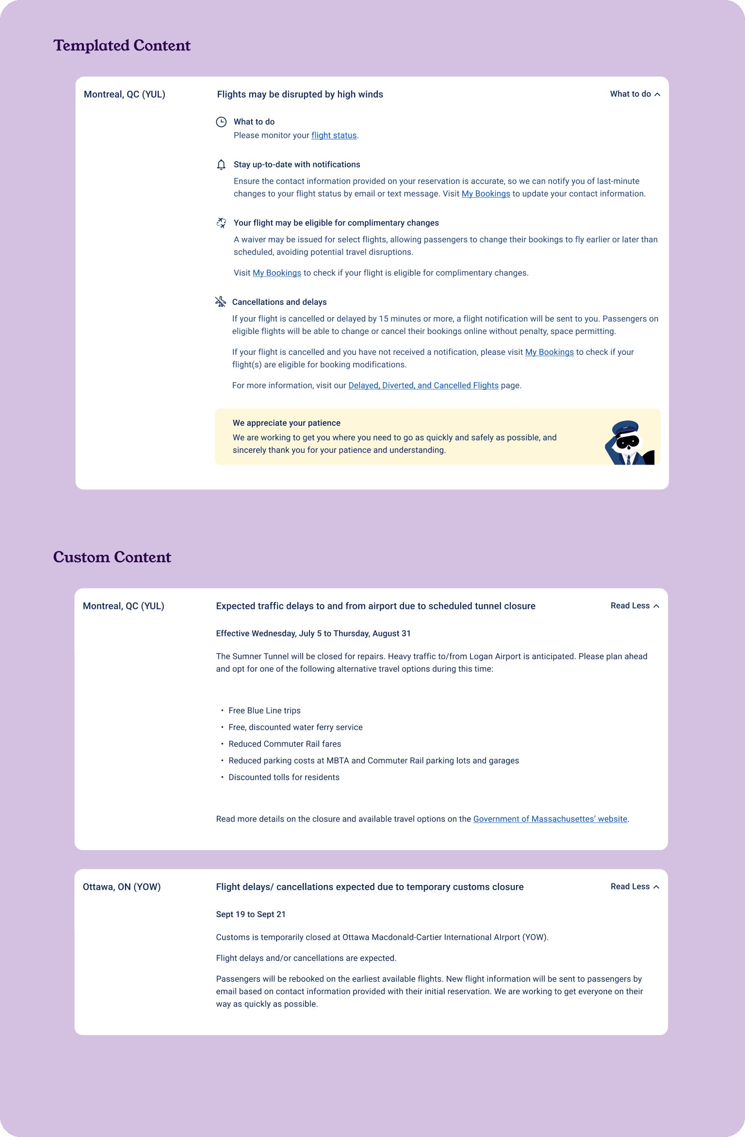
Examples of the different formats of content we had to design for:
Implementation with Internal Teams
The success of the new page design lay heavily in the new categorization of alerts and advisories. A new categorization system meant that:
The internal communications tool used to post communications to the page would require updates.
The teams posting to the page would need to understand the new system and the changes made to the tool they use.
To tackle this supporting work, I had to:

Interview teams
who post alerts/advisories to understand how they use the tool

Align back-end and front-end
Align back-end labelling system with front-end (customer-facing) labels to reduce confusion

Create guidelines
for teams to use as reference when learning and implementing the new system
Creating Guidelines
I presented the guidelines to the teams, explaining the new classification system. I showed the new designs to demonstrate how the new system improved the UX. Then I took them through the changes made to their internal communications tool.
The guidelines also included instructions on how to write the alerts, as a consistent approach to writing alerts is critical for the UX of the page
The teams provided me with feedback on these guidelines, and I made modifications where necessary.
Example pages from the guidelines


Outcomes and Learnings
Improved clarity in a key stage of the customer journey
The new solution was a huge success in that it achieved the goals and solved the problems identified. It was a huge improvement to the user experience, and it was much more visually appealing.
Streamlined processes for internal stakeholders
When we shared the solution with the teams that post to the page, they were impressed and grateful for the clarity provided to their own processes. The guidelines would be a good reference for them as they learn the new processes.
Close Collaboration
On a complex project like this, I recognized the importance of close collaboration with those who populate the content of the page. To create the most effective solution, it was necessary to properly identify the issues with the page. For a successful implementation and future use of the page, it was imperative that the teams posting alerts understood the changes made. We wanted the solution to be intuitive for these teams to reduce their mental load.
Next Case Study