
Travel Alerts & Advisories Redesign
Improving the Day-of Travel Experience
Role
Principal UX Designer
Team
3 others- UI Designer, Design Lead, Copywriter
Timeline
4 months
Tools
Figma, Userlytics
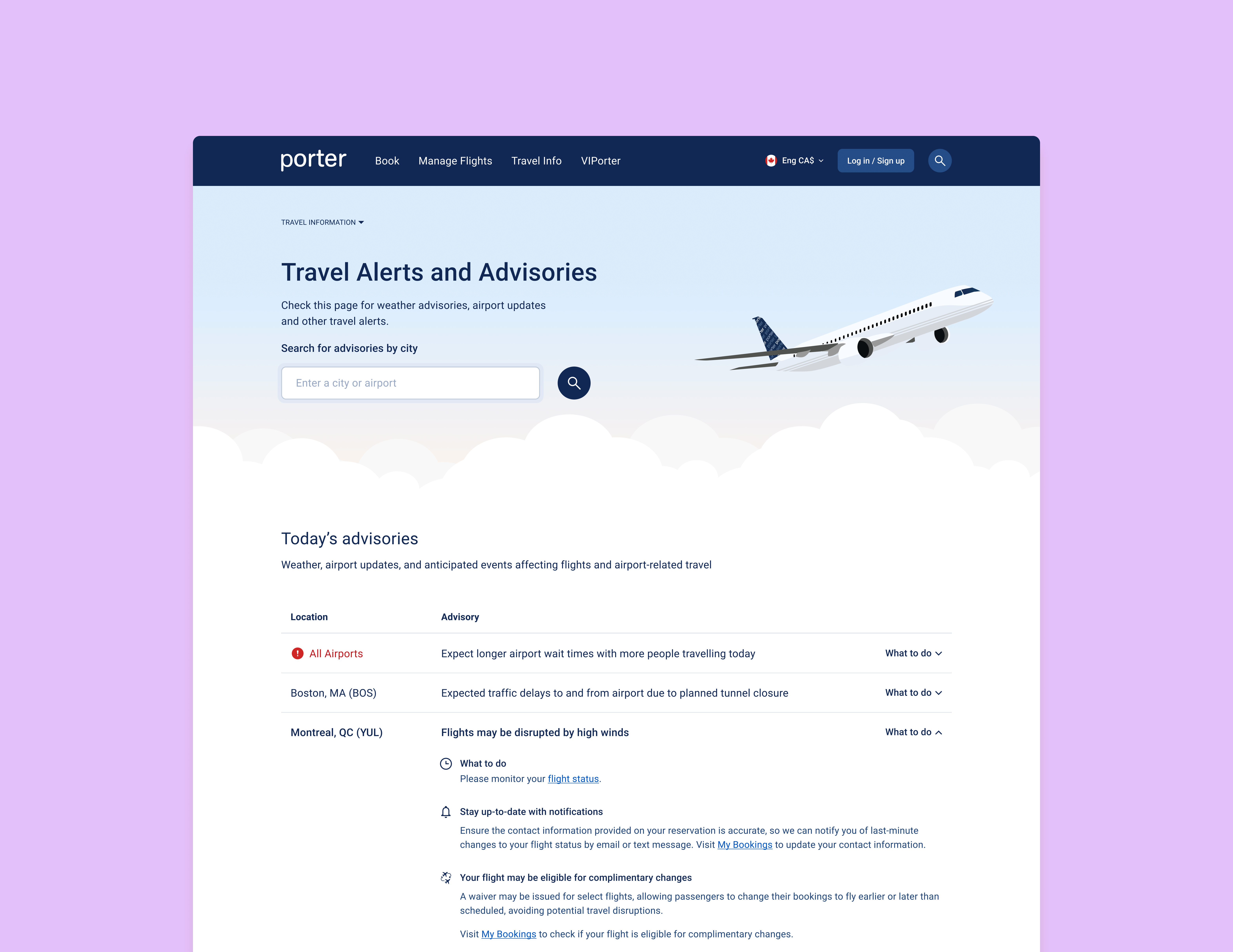
Improved clarity in a key stage of the customer journey
Streamlined processes for internal stakeholders
Created a modern and visually appealing experience
The Project
The Travel Alerts and Advisories page is one of the key communication touch points in the customer's pre-flight journey.
The task:
Modernize the visuals, bring it inline with new design system
Analyze the user experience and make any necessary improvements
Research & Discovery
Internal interviews
To get more insight into the usability issues on the page, I ran discussions and workshops with the teams that post communications to the page.
I uncovered the following issues:
Even the teams that post communications to the page could not tell us definitively what type of alert would be housed under each category.
Unclear/illogical categorization of alerts/advisories
The inability to identify when a new alert has been posted
Important information hidden in collapsed accordions
Existing page (alert accordion collapsed):
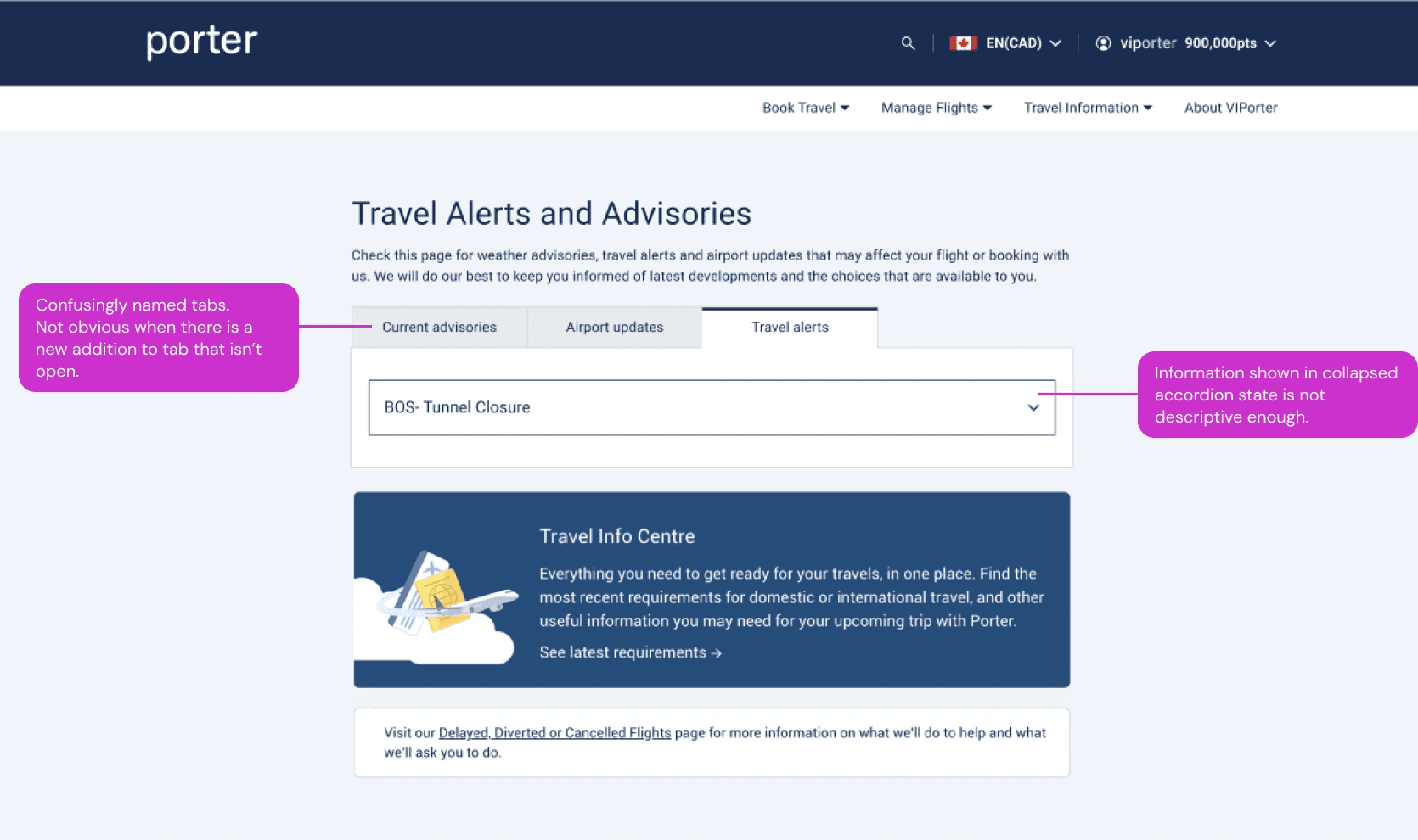
Existing page (alert accordion expanded):

Usability Testing
I performed unmoderated usability testing of the existing page to validate the concerns uncovered. I also wanted to find out if there were any other issues not yet identified.
The testing validated the initial concerns, showing that:
Users did not understand the differences between the categories
Users felt the information shown in the collapsed accordion was not sufficient
The testing uncovered further insights:
A lack of information hierarchy in the expanded accordions
A lack of guidance/information on next steps to take
The other information on the page was vague
Strategy
Taking into account the issues we discovered, I took a deeper dive into the use of the page:
When do people use this page?
What do they need to know?
Considering when and why people use this page, I made the assumption that:
A user comes to this page with a specific airport / location and date in mind
Recategorization of Alerts and Advisories
Now that I defined the specific use cases, it was time to tackle the reorganization of the different alert types. This was an important first step, as this would determine the structure of the page.
Using examples of past alerts, I identified a clear distinction between types. I used that to create 2 groups to organize the alerts more intuitively:
Those that impact flights
"Day of Travel Alerts"
Ex. traffic around the airport, weather-related events, airport-related updates, and company-wide service issues
Those that are nice to know
but don’t necessarily affect the day-of travel.
"Other Alerts"
includes government or policy- related events, not necessarily specific to a location
Copy Improvement
We recognized that in order to facilitate this new organization, the alerts must be written in a standardized way. This would allow us to organize them in a consistent way on the page.
In addition, there were opportunities to improve the UX from a copy standpoint. We worked with our team’s copywriter to rewrite the templates:
Focusing on the effect to the customer's travel, as opposed to simply stating events
Action-oriented as opposed to informational
Simpler, clearer and more concise
Wireframing
Collaborating with the UI Designer on the project, I sketched out some wireframes based on the 2 organizational groups we decided on: “Day-of Travel” and “Other Travel Alerts”.
Exploring Filter Methods
Considering the assumption we made that the majority of users are coming to this page with a city/airport in mind, we hypothesized that some form of filtering of the alerts would be helpful.
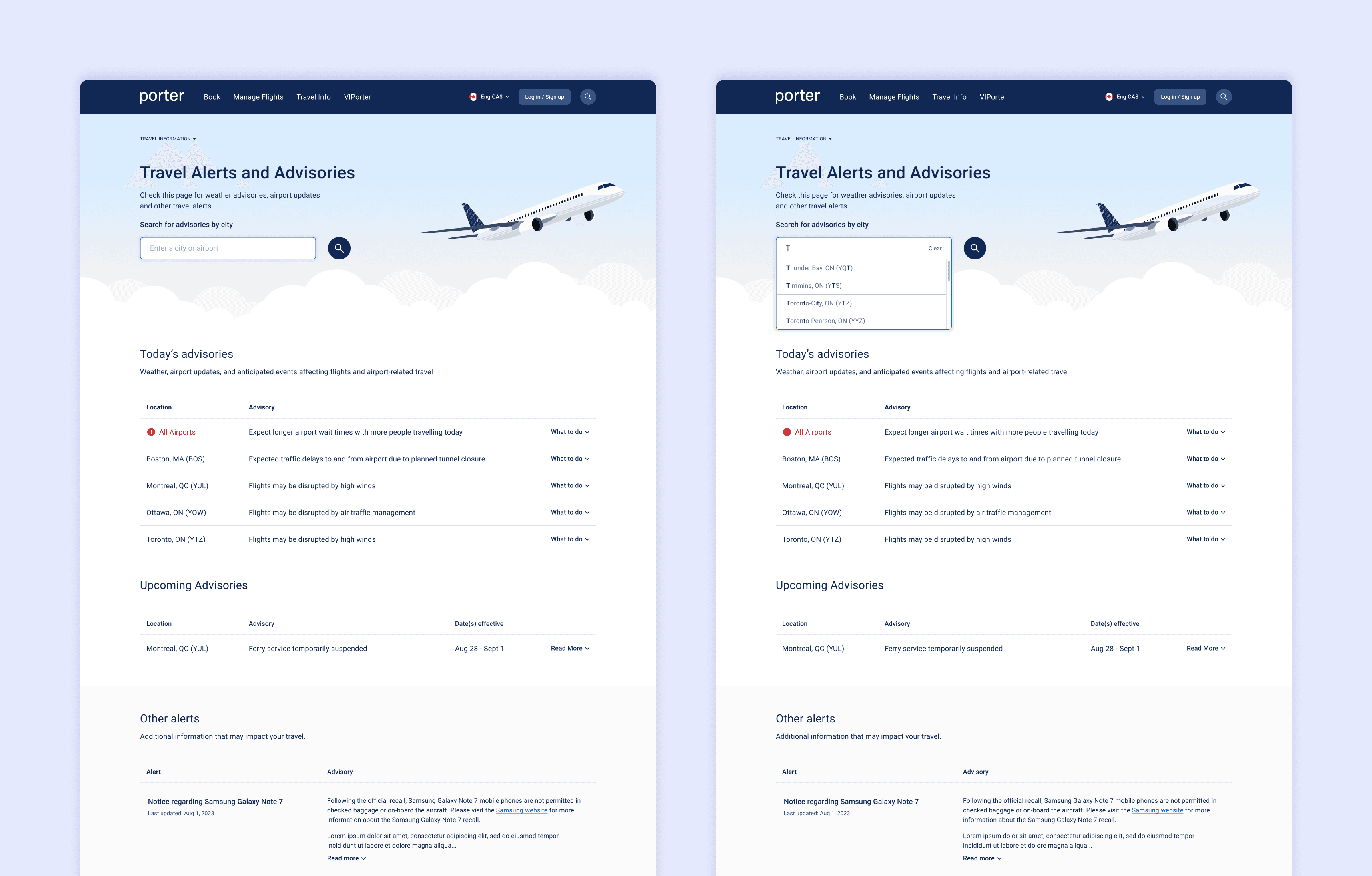
We explored a few different approaches to filtering, but decided on a prominently featured search bar.
This layout addresses customers with different needs, providing flexibility, while not over-complicating the use of the page.

High Fidelity
Once the concept and strategy were nailed down, I moved forward with higher-fidelity wireframes. It was an iterative process that involved detailed exploration of the different aspects of the page.
Below are some screenshots of the different content and functionalities on the page.
Searching For a Specific Airport
Advisory Content- By Type
The different formats of content we had to design for

Usability Testing
Did our design achieve the goals and solve the problems identified?
From testing, I was able to validate the following:
The organization of the alerts was intuitive.
The collapsed state of the accordions were clear and provided a good amount of detail.
The information in the expanded accordions was easy to read and provided helpful information for next steps.
Through testing, I also evaluated the usefulness of the search bar:
The feedback was somewhat positive, but mostly neutral.
We learned from the internal stakeholders that there are not typically many alerts posted at one time.
We re-evaluated the search bar, deciding that it would surface whenever there are 5 or more alerts. It would be hidden for anything less than that.
Handoff & Guidelines
The success of the new page design lay heavily in the new categorization of alerts and advisories. A new categorization system meant that:
The internal communications tool used to post communications to the page would require updates.
The teams posting to the page would need to understand the new system and the changes made to the tool they use.
To tackle this supporting work, I had to:

Interview teams
who post alerts/advisories to understand how they use the tool
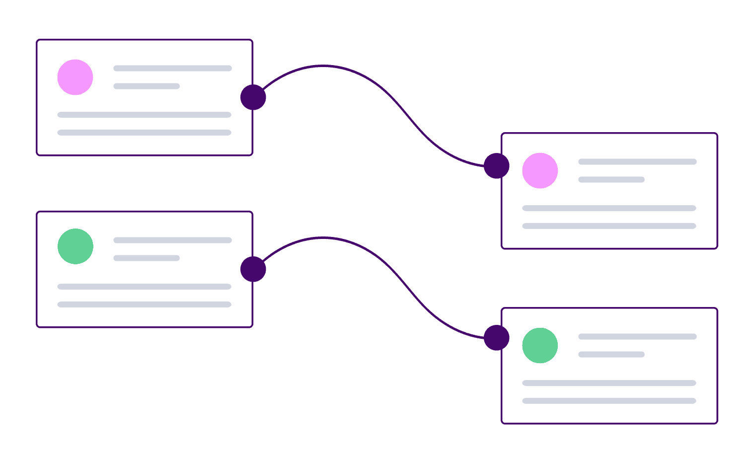
Align back-end and front-end
Align back-end labelling system with front-end (customer-facing) labels to reduce confusion

Create guidelines
for teams to use as reference when learning and implementing the new system
Creating Guidelines
I presented the guidelines to the teams, explaining the new classification system. I showed the new designs to demonstrate how the new system improved the UX. Then I took them through the changes made to their internal communications tool.
The guidelines also included instructions on how to write the alerts, as a consistent approach to writing alerts is critical for the UX of the page
Example pages from the guidelines
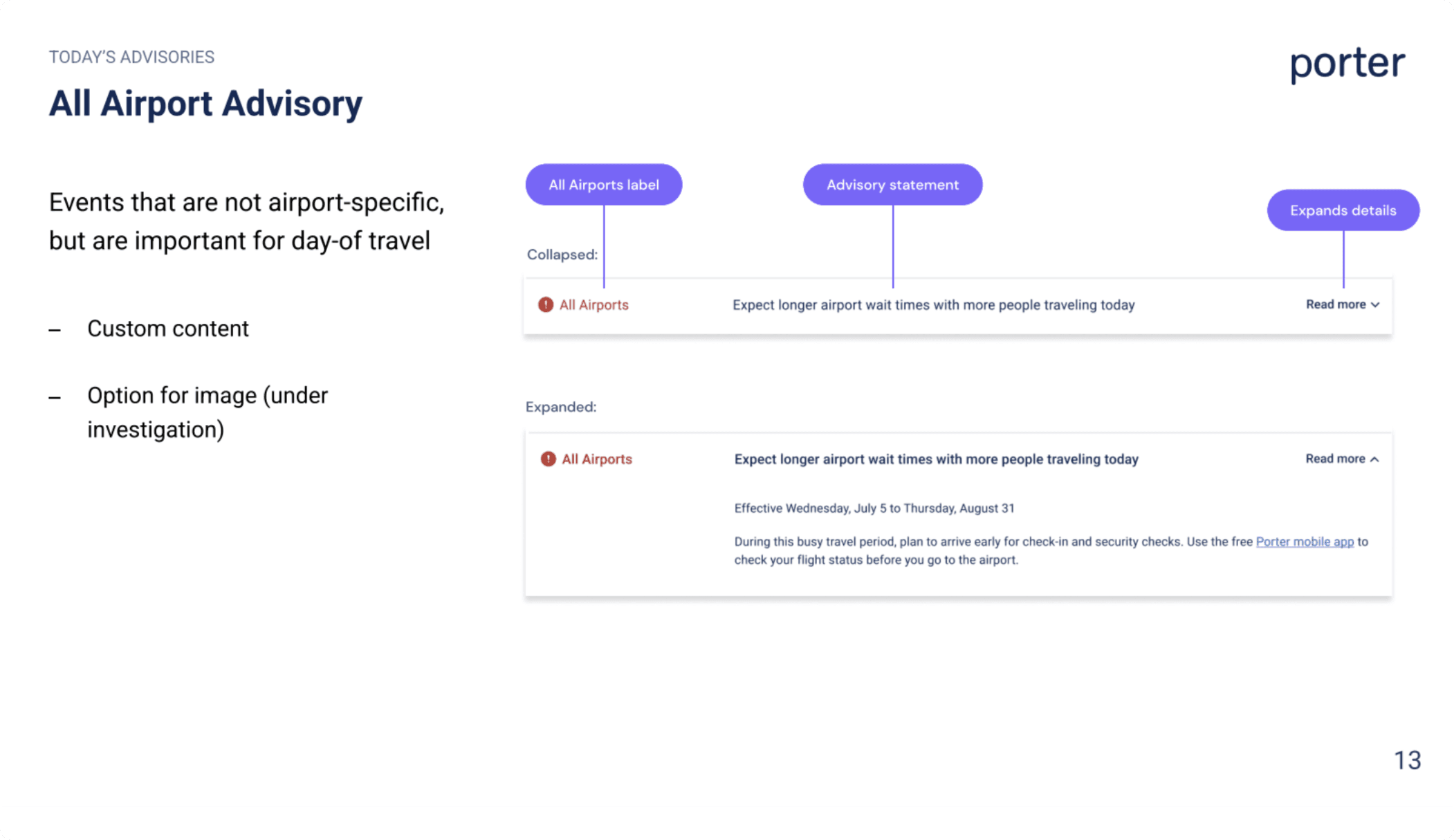

The teams provided me with feedback on these guidelines, and I made modifications where necessary. We recognized that close collaboration with these teams was important to the successful launch and future use of the page.
Next Case Study